Product & Trends Bright Futures: How Color Influences Learning Environments
Nov 30, 2024Education facility designers understand the effect that color can have on students' emotions, focus, and desire to engage in learning. The selection of colors for school environments is an important part of the design process. Colors can influence not only the mood and behavior of students but also their cognitive performance and overall classroom dynamics. When designers select colors for areas dedicated to learning, exploration, and introspection, they consider each space for its psychological impacts and intended uses. Here is a look at how colors fit the needs of the various spaces.
Colors for Learning Environments
The use of color is an important element in creating an atmosphere that promotes concentration and focus. Designers choose specific color schemes to transform educational spaces, making them more conducive to learning and positive study habits.
Green
Green hues can produce calming effects, promote relaxation, and can help reduce eye strain. Greens can create peaceful feelings and are particularly beneficial in spaces where students spend long periods reading or using computers.
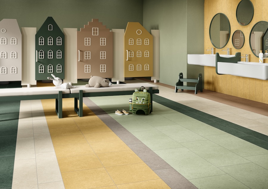 Crossville® Argent 2.0™ porcelain floor tile.
Blue
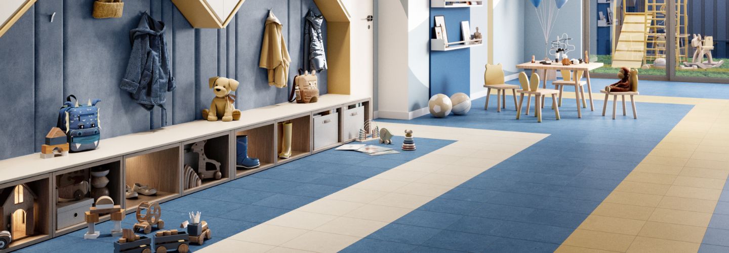
Shades of blue are frequently associated with a sense of tranquility and heightened concentration. Studies have shown that calming blue hues colors can significantly alleviate feelings of anxiety and boost overall productivity. Blue tones are beneficial for fostering sharp, clear thinking and sustained focus, making these colors ideal for tackling challenging subjects like mathematics and the sciences. The serenity that blue evokes can enhance mental clarity and create environments conducive to uninterrupted thought.
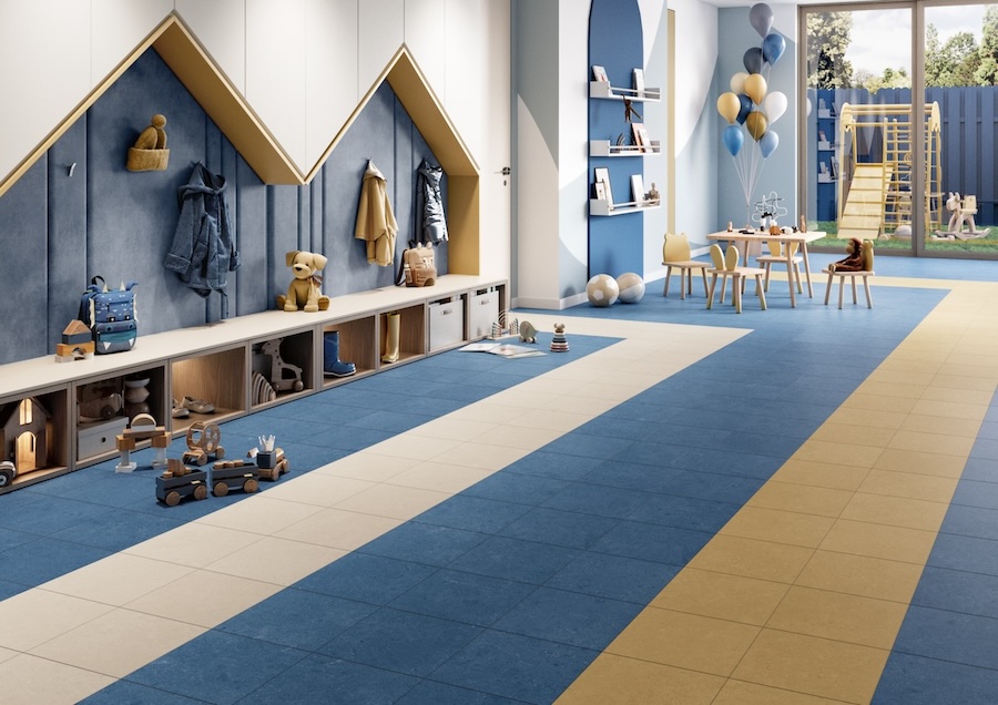
Crossville Argent 2.0™ porcelain floor tile in Memphis Blue and Golden Rod
Off-White or Pale Gray
Neutral colors like off-white and light gray are less distracting to allow forfor a greater sense of focus. The neutral hues create a calming atmosphere and evoke a sense of spaciousness and tranquility to help maintain focus while reducing feelings of being confined or overwhelmed.
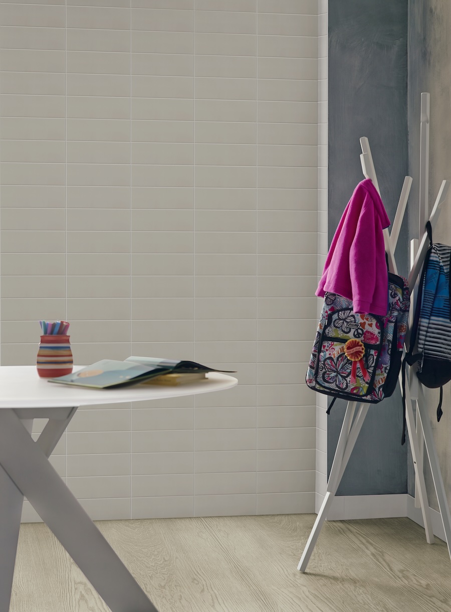 Crossville Color by Numbers™ wall tile in Sixth Sense.
Colors that Enhance Spaces for Exploration
Exploration spaces inspire creativity and encourage dynamic thinking. Art rooms and interactive learning centers are examples of exploration spaces that provide opportunities for hands-on experiences and imaginative exploration.
Orange
A lively, energetic color that evokes excitement and enthusiasm, orange can stimulate creativity and critical thinking. It is a fantastic color in settings designed for problem-solving and collaborative work.
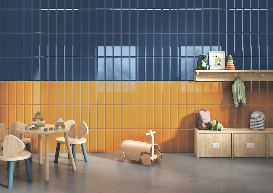 Crossville Color Perpectives ceramic wall tile in Pollen and Marine.
Yellow
Vibrant and invigorating yellow can stimulate mental activity and inspire creativity. It is an excellent choice for art spaces or any area where creative exploration is encouraged.
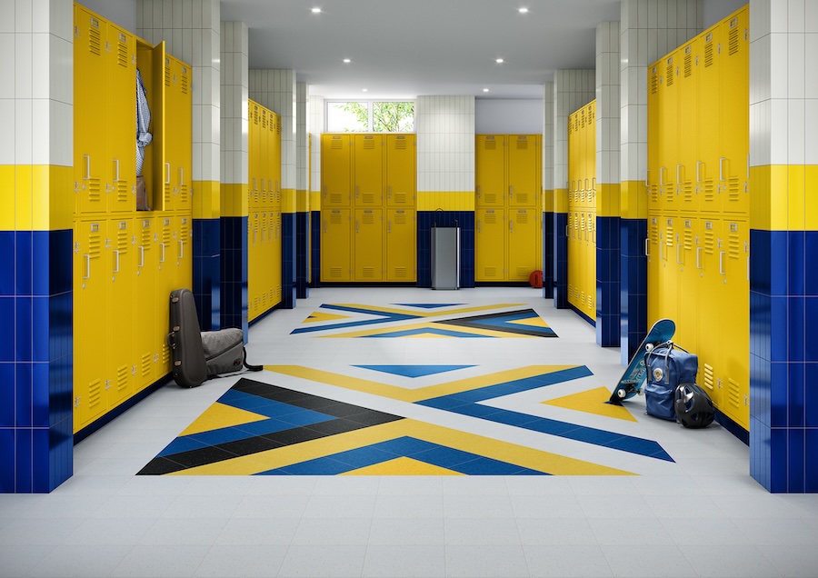 Wall: Crossville Swatches™ wall tile in Brilliant Deduction Cobalt BRI21, Brilliant Deduction Pineapple, Necessary Objects Cotton
AHF Contract Highlights™VCT | Santorini Blue HR003, Olympian Gold HR015, Delicate Glow HR014
AHF Contract Iliad™VCT | Dynastic White CR001, Imperial Black CR006
Armstrong Flooring Imperial® Texture VCT | Blue Cloud 51933, Blue Moon 57535
Colors for Introspective and Calming Zones
These zones are carefully crafted spaces designed to promote calmness and self-reflection. Cozy reading corners and sanctuaries dedicated to mental well-being are examples of places designed to foster a sense of peace and introspection. The colors in a space can invite students to unwind, reflect, and engage in personal activities.
Lavender
Light purple tones such as lavender are associated with spirituality and tranquility. These soft hues are renowned for soothing qualities, promoting a sense of peace. Because it can help facilitate a peaceful state of mind, it's an ideal color for spaces dedicated to mindfulness or relaxation.
Soft Blues and Greens
For creating atmospheres that encourage relaxation and introspection, soft blues are greens are ideal. These hues can evoke a sense of tranquility, help calm the mind, and encourage reflective thinking.
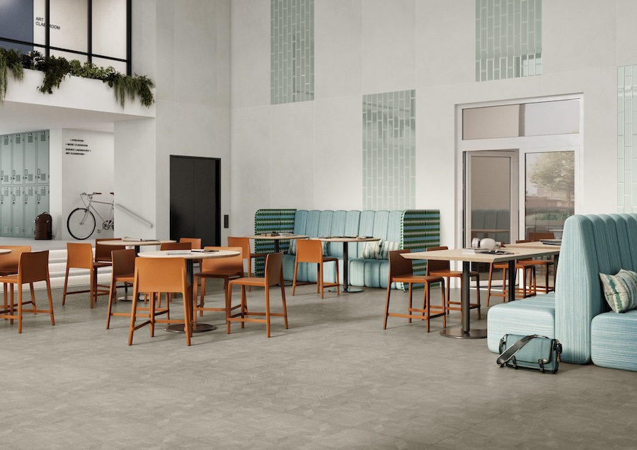 Walls: Calce porcelain panels by Laminam® in Avorio, and Crossville® Color Perspectives™ wall tile in Tea
Floor: Armstrong Flooring Nidra™
Earthen Colors
Earthy tones, such as rich browns and cramy beiges have the power to anchor a space, which can evoke a sense of safety and security. Designers often select these earthan hues for areas that are intended to provide emotional stability and a sense of grounding.
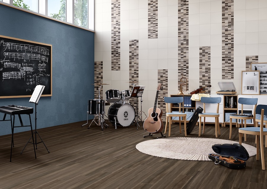
Wall: Crossville Shades 2.0™ porcelain tile in Vapor and Warm Grays mosaic on wall
Floor: Armstrong Flooring Biome™ LVT
Implementing Color Strategies in School Design
Color Intensity
When used with purpose, color intensity can positively affect the atmosphere of a space. Bright colors are stimulating, making them a good choice for active learning areas where energy and engagement are desired. Soft colors, on the other hand, are usually better suited for areas where concentration and a sense of calm are desired.
 Crossville Color Blox 2.0™ wall tile, Notorious™ porcelain floor tile
Using Color to Create Balance
Color combinations can be a powerful tool for creating balance in interior designs, especially in school environments. By incorporating vibrant accent walls, for example, designers can introduce bursts of colors to harmonize with neutral backgrounds, offering visual interest without overpowering a space.
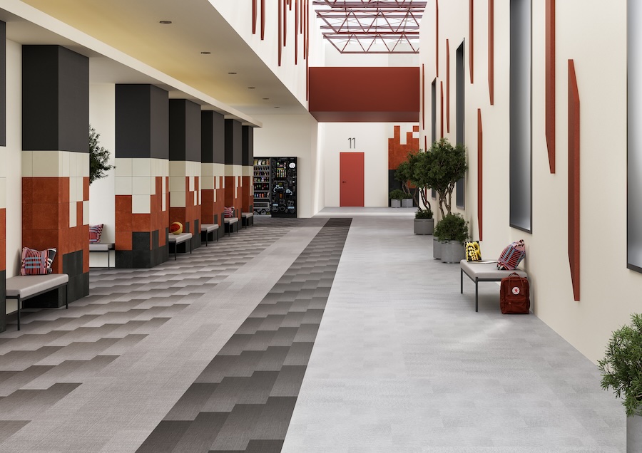 Walls: Crossville Color Blox 2.0™ porcelain tile in Cayenne, See the Moon, and Cotton Sheet
Flooring: Armstrong Zenscape™ Heterogeneous Sheet, Armstrong Flooring Exchange™ LVT
Adaptability
Adaptability considers the age and activities of the students. Vibrant colors can be particularly beneficial in certain spaces for young children, as these hues capture students' attention and foster an engaging atmosphere. Older students usually benefit from more subdued tones that minimize distractions. Serene spaces encourage focus and enhance concentration.
.jpeg?lang=en-US)
Wall: Crossville Shades 2.0™ porcelain floor and wall tile in Whites Mosaic.
Floor: Armstrong Flooring Medintone® Homogeneous Sheet and Armstrong VCT Feature™ Tile.
Strategic use of color can significantly enhance the educational experience, influencing everything from mood and mental clarity to energy levels and creative capacity. Through careful color selection, education designers can create environments that support both academic success and overall well-being. Crossville Studios offers a plethora of tile collections in on-trend trend hues to help designers realize their visions for school design projects.
Designing an Educational Space?
If you're getting ready to design or renovate an educational facility and looking for safe, healthy, durable, and beautiful surface solutions, we invite you to explore our practical ceramic and porcelain tile options for floors, walls, and countertops. Learn more. https://www.crossvillestudios.com/commercial-tile-countertops/education


